Designing Better Shopify Stores, One Component at a Time
The Smallest Element Can Make the Biggest Difference
When people think about e-commerce design, they usually focus on the obvious pieces: beautiful photography, polished product cards, and compelling landing pages. Yet one of the most important interactions on any online store often goes unnoticed, the button. It appears dozens of times throughout the customer journey, quietly guiding visitors from curiosity to purchase. While its purpose never changes, its presentation absolutely can. Subtle adjustments to shape, spacing, typography, borders, shadows, and motion all influence how a button feels before anyone clicks it. Like every other design element, a great button doesn't simply ask for attention, it earns it.
The Same Product, A Completely Different Story
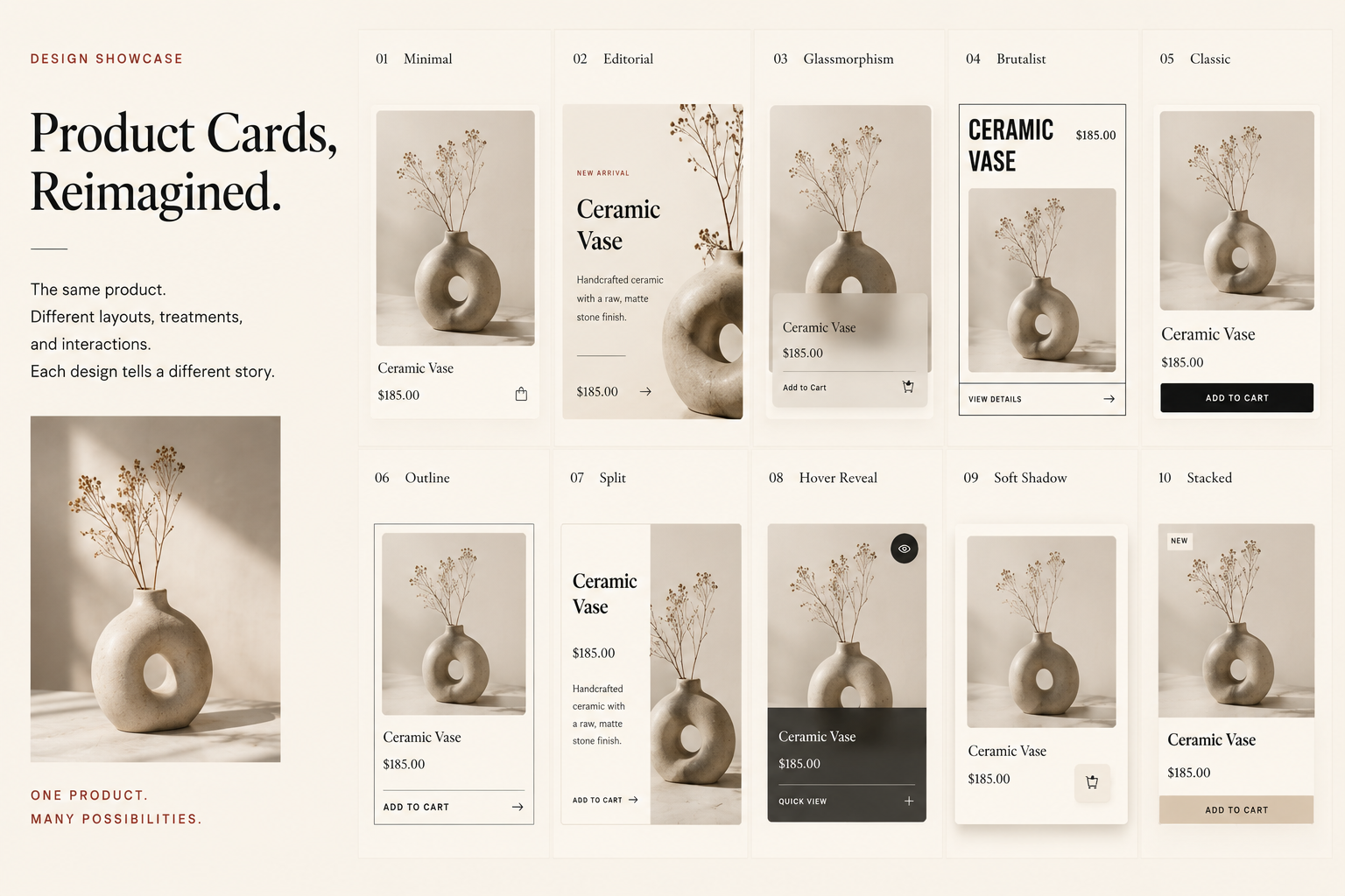
One of the easiest ways to tell whether a storefront was thoughtfully designed is to ignore the product for a moment and look at the card itself. Most themes reuse the same generic layout everywhere: a rectangular image, a product name, a price, and a button. It works, but it rarely creates emotion. The experience feels interchangeable, and every product begins to blend into the next.
Product Card Style Lab
One product. Six different moods.
Same image. Same product. Same price. The card design changes the entire buying feeling.
Now compare that with a product card designed around a specific mood. Without changing the product, the photo, or even the price, subtle shifts in spacing, typography, shadows, borders, layering, and color completely reshape the customer's first impression. One version feels like a luxury boutique. Another resembles an editorial magazine. Another leans bold and contemporary, while a glassmorphism treatment feels polished and futuristic. The product never changed, only the presentation did. Great e-commerce design isn't decoration; it's storytelling. The right card helps customers imagine the brand before they even begin reading the details.
Great E-Commerce Design Lives in the Details
It's easy to focus on dramatic redesigns, but memorable online stores are usually built through hundreds of thoughtful decisions rather than one revolutionary feature. Product cards establish a first impression. Buttons guide action. Price displays communicate value. Individually, these elements may seem small, yet together they create a shopping experience that feels intentional, trustworthy, and unmistakably on-brand.
Whether you're building a Shopify storefront from scratch or refining an existing one, don't overlook the components customers interact with dozens of times during a visit. The strongest e-commerce experiences are rarely the loudest, they're the ones where every detail feels considered. When typography, spacing, motion, color, and hierarchy work together, customers stop noticing the interface and start enjoying the shopping experience itself.
Design Showcase
Price Displays, Reimagined.
The same number can feel minimal, premium, promotional, boutique, or editorial depending on how it is presented.
01 Minimal
02 Editorial
03 Boutique
04 Premium
05 Compare At
06 Luxury
07 Split
08 Modern
09 Savings
10 Payment
11 Handwritten
12 Heritage
Thoughtful Design Is Never an Accident
Behind every polished storefront is a long series of intentional choices. The examples throughout this article all began with the same products, the same information, and the same goal—helping someone make a purchase. What changed wasn't the content, but the way it was presented. That's the power of thoughtful design. It creates clarity, builds confidence, and gives a brand a personality that customers remember long after they've left the page.
Whether you're launching a new store or refining an established one, investing in the details is rarely wasted effort. Every interaction is an opportunity to reinforce your brand, reduce friction, and make shopping feel just a little more enjoyable. The best e-commerce experiences don't happen by chance. They're carefully crafted, one thoughtful decision at a time.